Time series with pandas et matplotlib
When it comes to data analysis, the Python language is very well equipped with high quality open source libraries, such as NumPy, pandas or matplotlib. In this article, I will show how to use these libraries to manipulate and visualize time series data.
What is a time series?
A time series is simply a sequence of data associated to dates (or times, depending on the precision you need). Some typical examples of time series would be:
- the daily maximal temperature in a city
- the response time of HTTP requests processed by a web server
- the closing price of a share on the stock market
- the population of a country (measured every year for instance)
The interval between two points in a time series may be fixed, like in the first example (the interval is always one day), or variable, like in the second example (the interval between two HTTP requests depends on the traffic of the server).
As a time series can contain a lot of points, it’s usually not practical to work directly with this data. Instead, two common ways of exploring time series data are:
Extraction of statistics, i.e. numbers which summarize important characteristics of your data, like the average (mean) or the dispersion (variance). Visualization of the data with graphs, histograms, heat maps, charts, or any other graphical representation which can you help understand what the data actually represents. Both can be done with a spreadsheet like MS Excel, but once you start manipulating big data sets with hundreds of thousands of values, switching to Python is much more practical.
Introducing NumPy, pandas and matplotlib


NumPy is the fundamental package for scientific computing in Python. It’s a library offering efficient functions to manipulate vectors and matrices, with the ease of use of Python, and the performance of native C code.
pandas is a data analysis library built on top of NumPy, with high performance and ease of use. pandas provides functions to easily read data from CSV files, re-organize your data, compute aggregated data or statistics, manipulate time series, and much more.
matplotlib is a plotting library for Python, able to produce high quality graphs of any kind: histograms, plots, 2D histograms, charts, scatterplots, and more.
These libraries play very well together, and are actually all part of the SciPy stack, which is a collection of Python libraries dedicated to scientific computing.
If they are not part of your Python distribution, you can install the latest version of these libraries with pip:
pip install numpy pandas matplotlib
In case of problems, look for alternate installation methods on SciPy.org.
Plot Google stock price
Now let’s see with a concrete example how to plot the following graph:
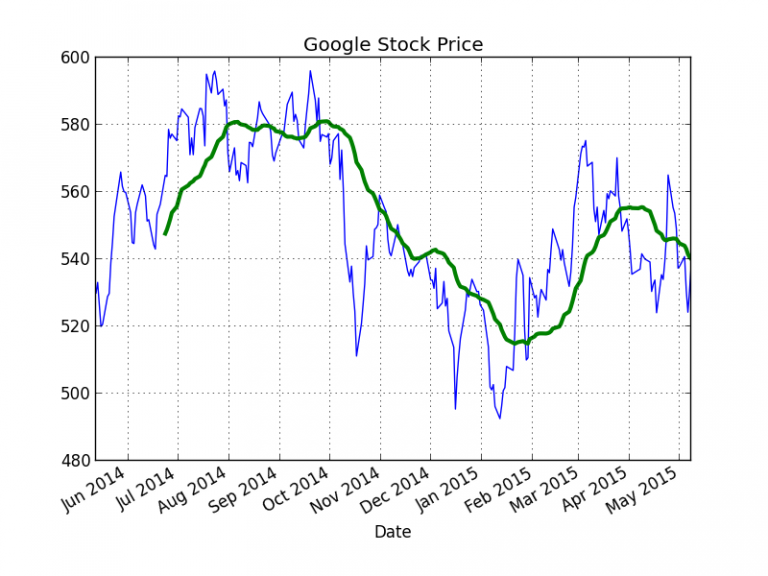
This graph display the daily closing price of Google share on the stock market over the past year, along with a 30-day moving average.
Here is the Python code used to produce this graph, thanks to pandas and matplotlib:
from datetime import datetime, timedelta
import pandas as pd
import matplotlib.pyplot as plt
import matplotlib.finance as finance

# Get Google stock price from Yahoo! Finance
end = datetime.now()
begin = end - timedelta(days=365)
with finance.fetch_historical_yahoo('GOOG', begin, end) as fh:
    df = pd.read_csv(fh, parse_dates=True, index_col=0)
# Keep only the closing price, and sort by date
price = df['Close'].sort_index()
# Compute the 30-day moving average
price_avg = pd.rolling_mean(price, 30)
# Plot the stock price
price_plot = price.plot()
# And plot the average on the same graph, using a line width of 3
price_avg.plot(ax=price_plot, lw=3)
plt.title('Google Stock Price')
plt.show()
Though it looks quite simple, this code deserves some explanation.
matplotlib provides a built-in function to fetch historical stock data from Yahoo! Finance (line 9), which returns a CSV file like this:
Date,Open,High,Low,Close,Volume,Adj Close
2015-05-08,536.65002,541.15002,525.00,538.21997,1510700,538.21997
2015-05-07,523.98999,533.46002,521.75,530.70001,1546300,530.70001
2015-05-06,531.23999,532.38,521.08502,524.21997,1567000,524.21997
2015-05-05,538.21002,539.73999,530.39099,530.79999,1383100,530.79999
...
Thanks to pandas.read_csv function, this CSV file is transformed directly into a pandas object called a DataFrame, which is a table indexed by rows and columns.
If we print this data frame (the contents of df variable), we get:
>>> df
                 Open       High        Low      Close   Volume  Adj Close
Date
2015-05-08  536.65002  541.15002  525.00000  538.21997  1510700  538.21997
2015-05-07  523.98999  533.46002  521.75000  530.70001  1546300  530.70001
2015-05-06  531.23999  532.38000  521.08502  524.21997  1567000  524.21997
...
We can see that the columns have been given names automatically from the header of the CSV file, and that the date has been used as an index for the rows (pandas did that thanks to the parameter index_col=0).
Thanks to these indexes, we can access an individual cell of the data frame like this:
>>> df['2014-06-13']['Close']
Date
2014-06-13    551.76251
Name: Close, dtype: float64
As our data frame is sorted in the wrong order, we need to call sort_index to sort it by chronological order.
Then pandas.rolling_mean computes the moving average on 30 days and returns another data frame. It’s a simple as that!
Now we can call plot method on our data frames to plot them with matplotlib, and we are done!
Note that plt.show() launches an image viewer directly from your program. If you want to save the graph in a png file, you can call plt.savefig(‘google.png’) instead.
Plot random data
Now, here is another example showing how to use NumPy in combination with pandas:
import numpy as np
import pandas as pd
import matplotlib.pyplot as plt

# Generate a series of 2000 dates, starting from 2015-01-01, with an interval
# of 1 hour
dates = pd.date_range('20150101', periods=2000, freq='1H')
# Generate a NumPy array of 2000 values, from a sinusoidal function
values = 2 * np.fromfunction(lambda i: np.sin(4*i/1000), (2000,))
# Add random values (with a gaussian distribution) to the previous array
values += np.random.normal(6, size=2000)
# Build a data frame associating the array of dates to the array of random
# values (indexed by dates). Give the "Value" name to the value column.
# The resulting data frame will look like:
#                         Value
#2015-01-01 00:00:00   5.790988
#2015-01-01 01:00:00   7.180237
#2015-01-01 02:00:00   5.248410
#2015-01-01 03:00:00   4.830652
#...
df = pd.DataFrame(values, index=dates, columns=['Value'])
# Compute the moving average on 48 hours
avg = pd.rolling_mean(df, 48)
# Plot the data frame in green. By default the legend is the name of
# the column (here "Value")
values_plot = df.plot(color='g')
# Plot the moving average on the same graph, in black
avg.plot(color='k', ax=values_plot, legend=0)
plt.show()
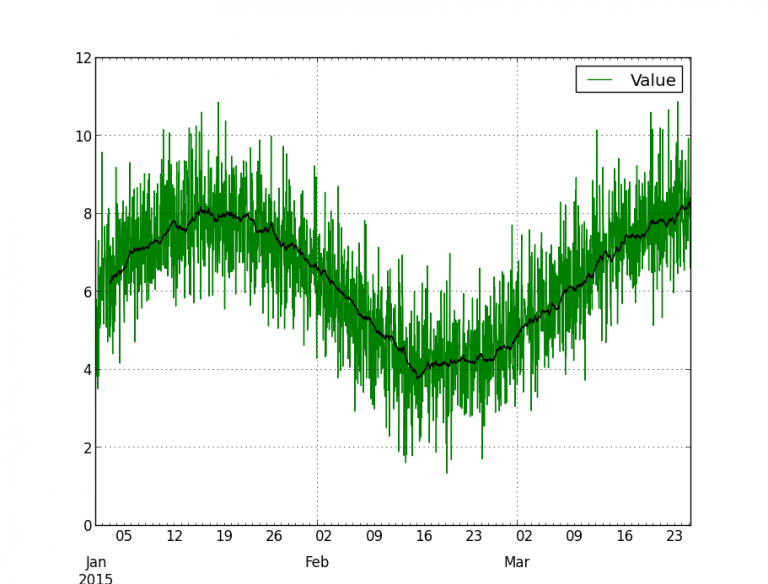
This program generates a time series with random values centered on a sinusoid, and plots the series with its moving average:
Plot frequency of occurrences of an event
More than often, I need to plot the frequency of occurrences of a specific event over a given period, for instance the number of requests per hour in a web server.
This looks like a basic problem, but it’s surprisingly difficult to find information on how to do this in a simple way.
The first step is to get a series of timestamps corresponding to the event we want to count. Let’s suppose we have stored these timestamps in a file events.txt, looking like this:
30/Apr/2015T06:25:06
30/Apr/2015T06:25:09
30/Apr/2015T06:25:09
30/Apr/2015T06:25:09
30/Apr/2015T06:25:10
...
29/Apr/2015T06:24:54
29/Apr/2015T06:24:57
29/Apr/2015T06:24:57
29/Apr/2015T06:24:58
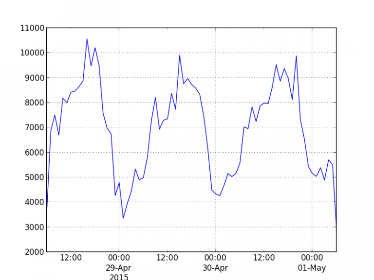
Now, the goal is to plot the number of events per hours, like this:
Here is a very simple program using pandas and matplotlib to produce this graph:
import pandas as pd
import matplotlib.pyplot as plt

# Create a data frame from the file containing timestamps
# This data frame will look like:
# >>> df
#                  events
# 0   2015-04-30 06:25:06
# 1   2015-04-30 06:25:09
# 2   2015-04-30 06:25:09
# 3   2015-04-30 06:25:09
# ...
df = pd.read_csv('events.txt', header=None, parse_dates={'events': [0]})
# Aggregate number of events per hour, and plot the result
df.events.value_counts().resample('1h', how=sum).plot()
plt.show()
So, how does this work?
The data frame returned by read_csv has a single value column, which we have named « events », containing the timestamps. Note that unlike in the previous examples, we don’t use the dates as an index for the rows, but we keep the default index (0, 1, 2, 3, etc.).
By calling value_counts on this column, we get a new data frame containing the number of events for each timestamp:
>>> df.events.value_counts()
2015-04-30 19:49:43    71
2015-04-28 18:58:16    64
2015-04-28 10:40:24    63
2015-04-28 13:56:39    56
...
2015-04-28 13:25:04     1
2015-04-28 16:02:37     1
2015-04-29 17:25:59     1
dtype: int64
So, this new data frame actually contains the number of events per second.
To get the number of events per hour, we just call resample on this data frame, and ask the method to sum the values by periods of 1 hour:
>>> df.events.value_counts().resample('1h', how=sum)
2015-04-28 06:00:00     3615
2015-04-28 07:00:00     6868
2015-04-28 08:00:00     7504
2015-04-28 09:00:00     6700
...
2015-05-01 04:00:00     5702
2015-05-01 05:00:00     5509
2015-05-01 06:00:00     2856
Freq: H, dtype: int64
Very simple, isn’t it?
At this point, we just need to call plot on the data frame, and pandas does the rest!
Conclusion
I have just scratched the surface of the possibilities offered by pandas and matplotlib, but I hope it’s enough to show you how easy it is to manipulate and visualize data with these libraries! Don’t hesitate to go through their documentation, it’s very clear and complete.